Required Questions1. The art criticism process is 4 steps. 1 is to look at the obvious. 2 is to analyze the artwork. 3 is to decide on an interpretation. 4 is to make a judgement call. Criticizing the art is about interpreting the art and telling whether the art communicates a message to the audience. 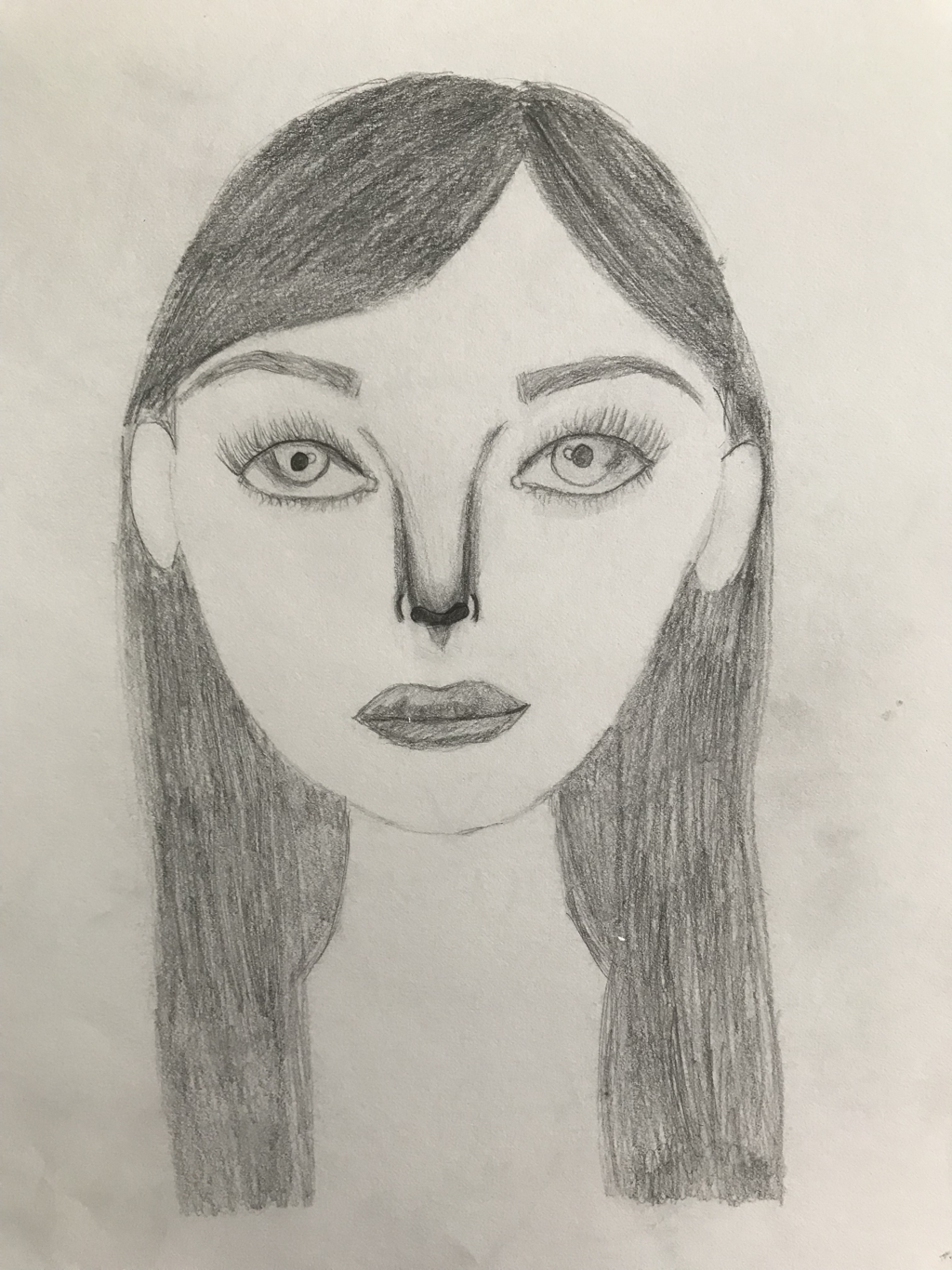 2. Using the criticizing process from the first question 1) the picture is of a person who has normal human characteristics. 2) the nose was hard and i feel as if the eyes were pretty good and realistic. 3 Questions8. The warmup most helpful was the sign language alphabet. It taught me how to put detail into everything and how to draw hands. Hands have always been super hard to draw so this really helped. 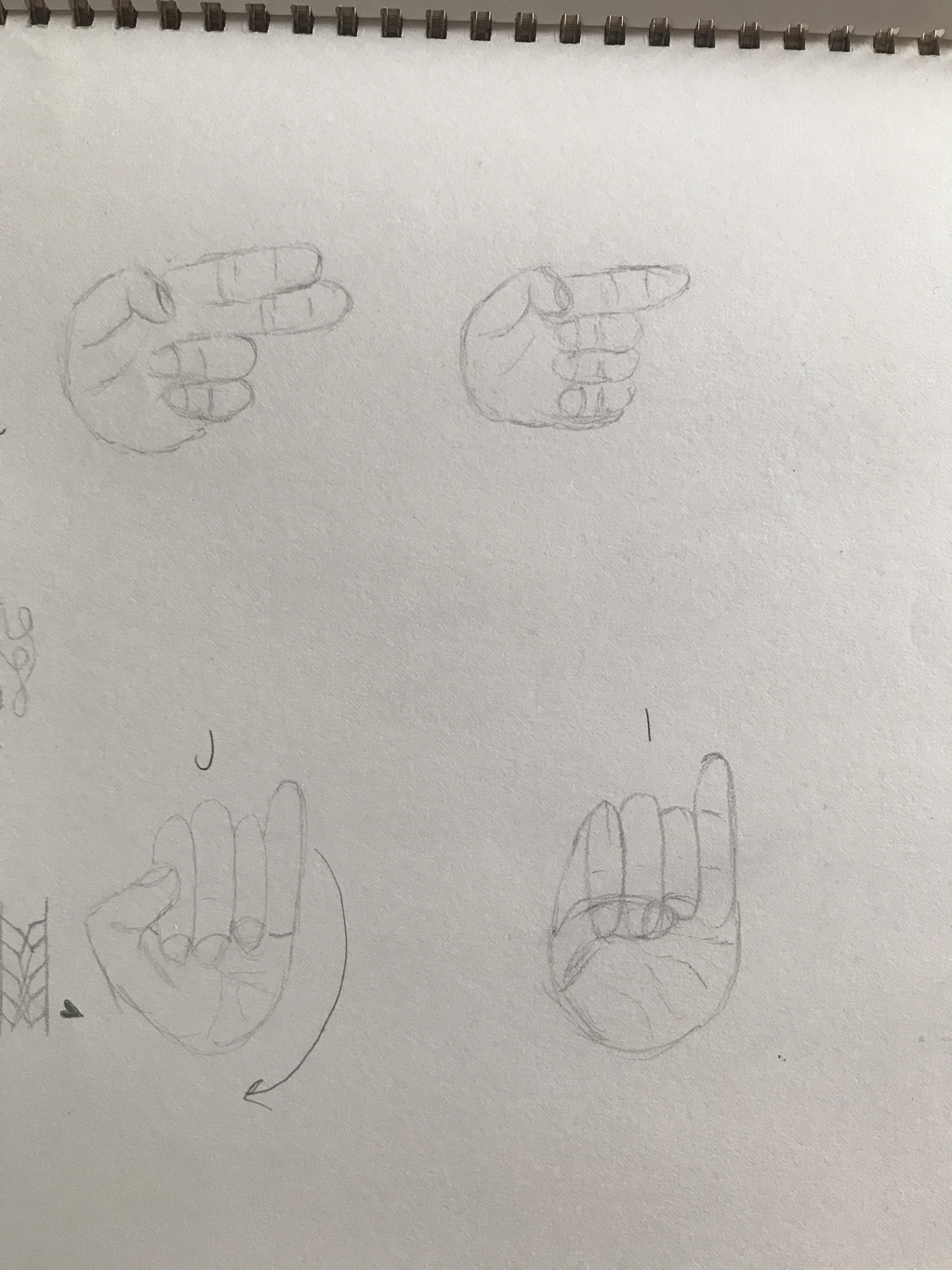 9. I feel like the illustration Friday’s did give some idea for main projects. Not always but it did sometimes because they were little ideas that you could make a main picture. Most of the time they are broad ideas too so you could take it in any direction. 
0 Comments
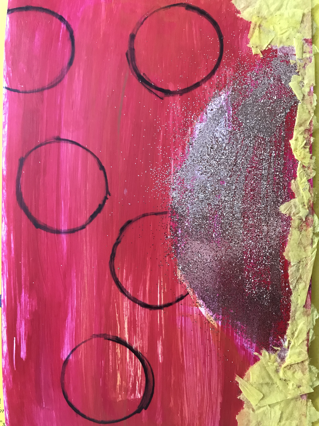 1. First I painted the back a reddish pink and added some orange and yellow to give it a sunset look. Then i put the glitter on as the sun because it shines. Next i put the yellow tissue paper at the bottom just to represent more of the sky. Finally I drew circles with marker just because it looks cool.
 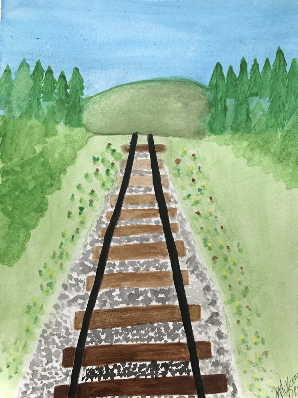   1. I used perspective 1 in my watercolor painting.
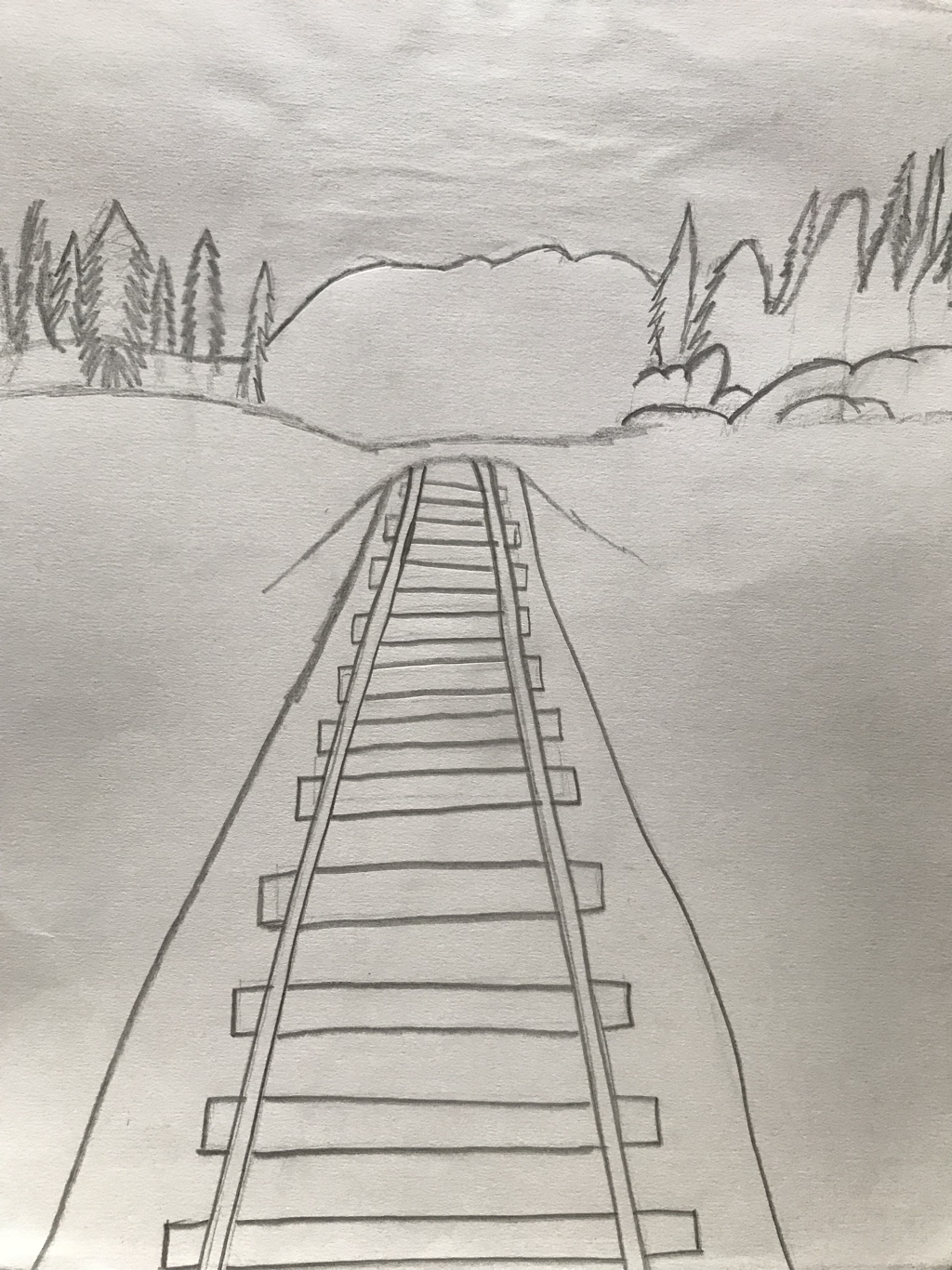
2.I took this photo in downtown Apex and i used it because i love train tracks and i realized it would be good for perspective. 3. I found making everything around the train tracks to make them look farther away if they are at the tip is hard. 4. The 2 warmups i picker helped because the watercolor one shows you different ways of using the watercolor and the perspective one shows you all the different perspectives. 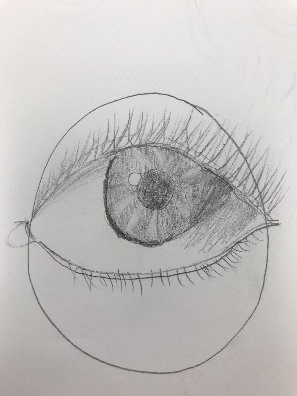 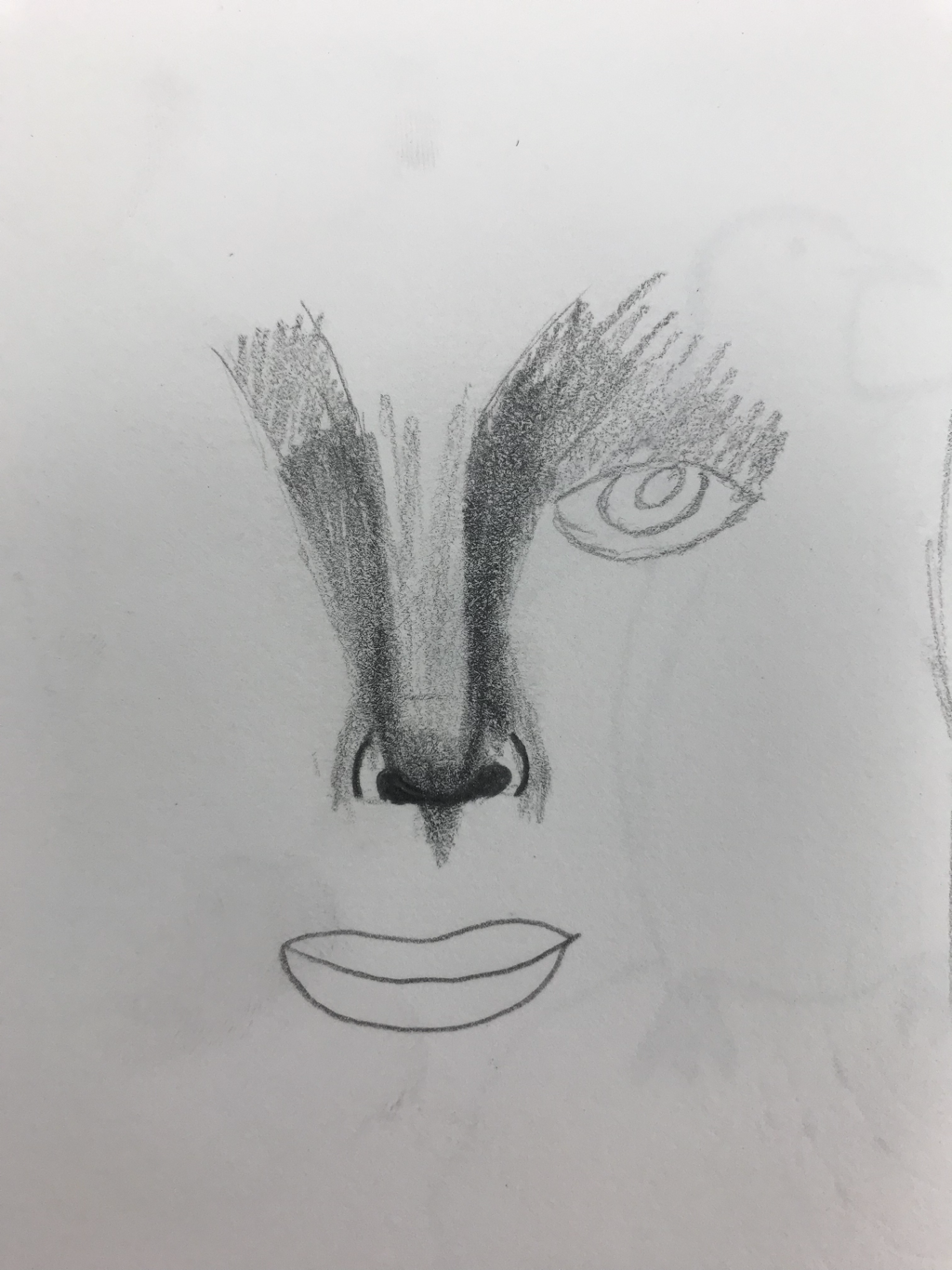   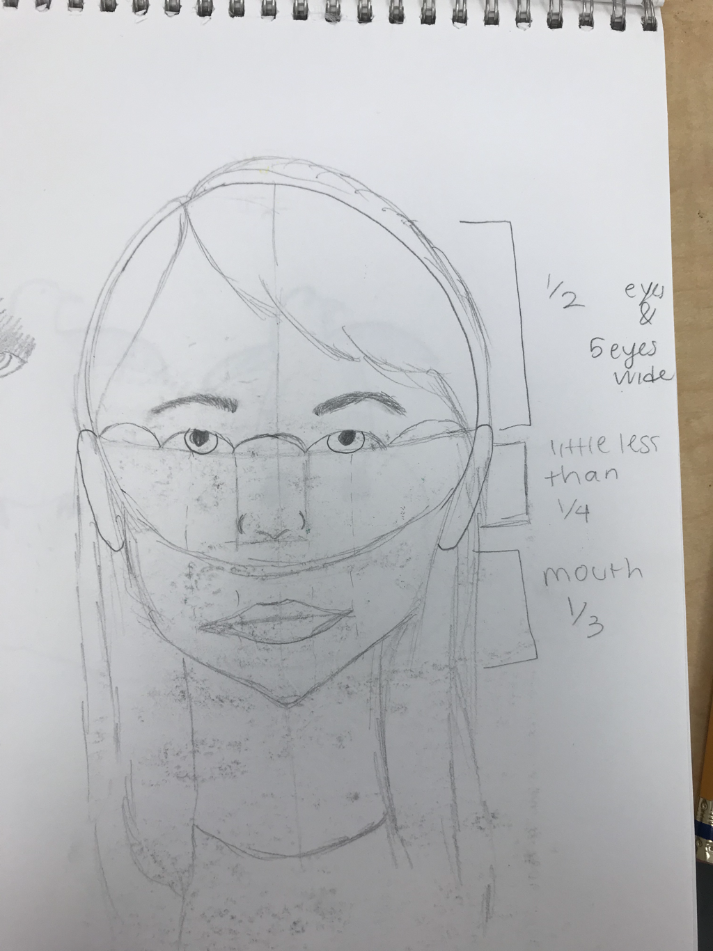   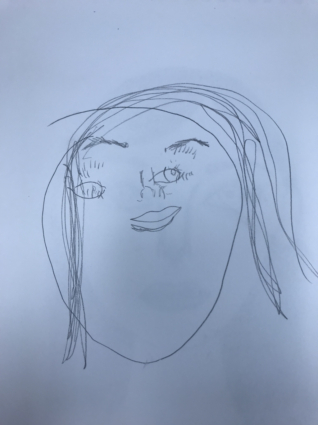 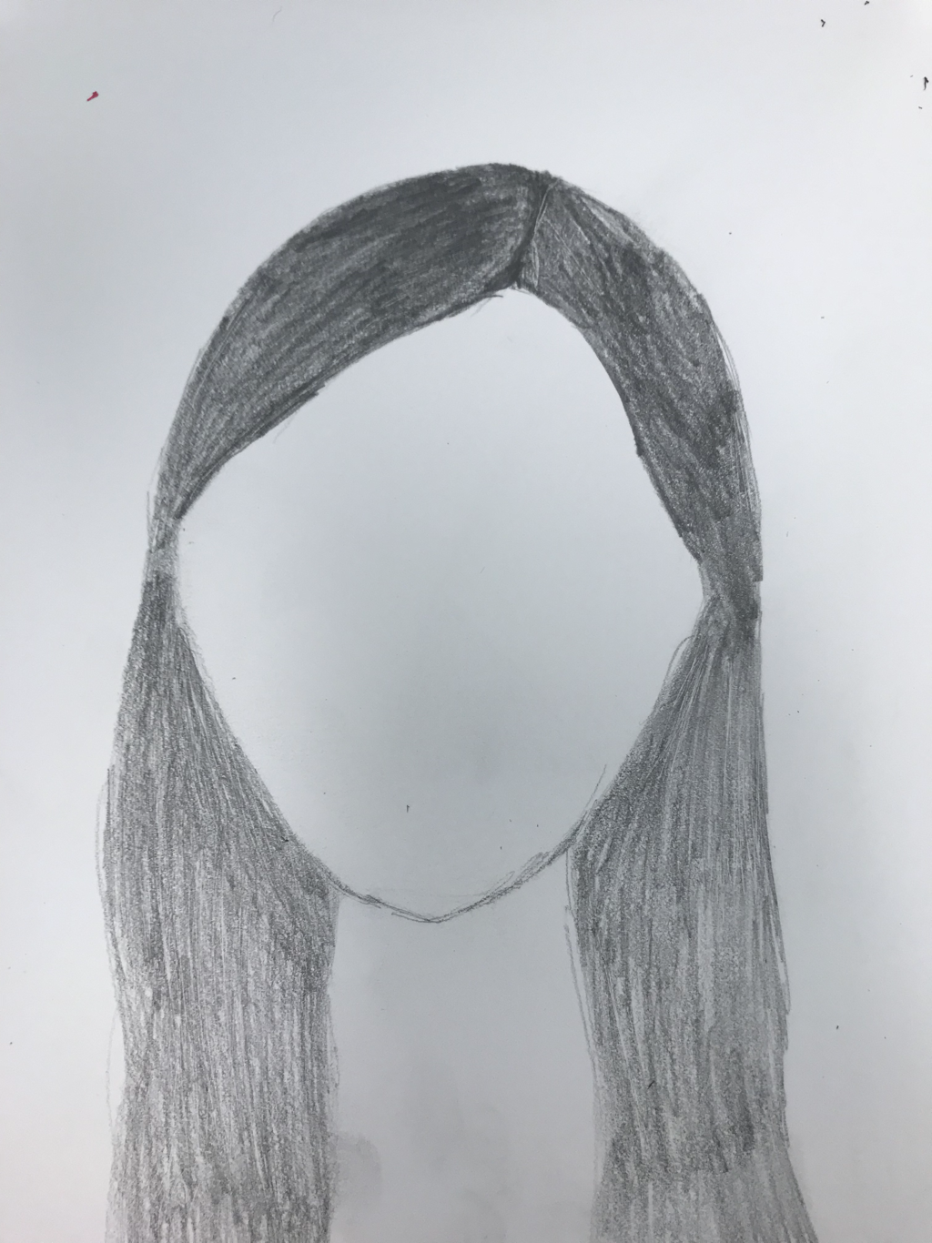 1. The warmup most helpful to me in my portrait piece is the nose. Before, I used to draw triangle noses and it would make everything look so unrealistic.
2. The thing i found most surprising about the facial proportions is how the eyes are half way down the face. Since there is more things that take up the space under them it seems like they’d be farther up. 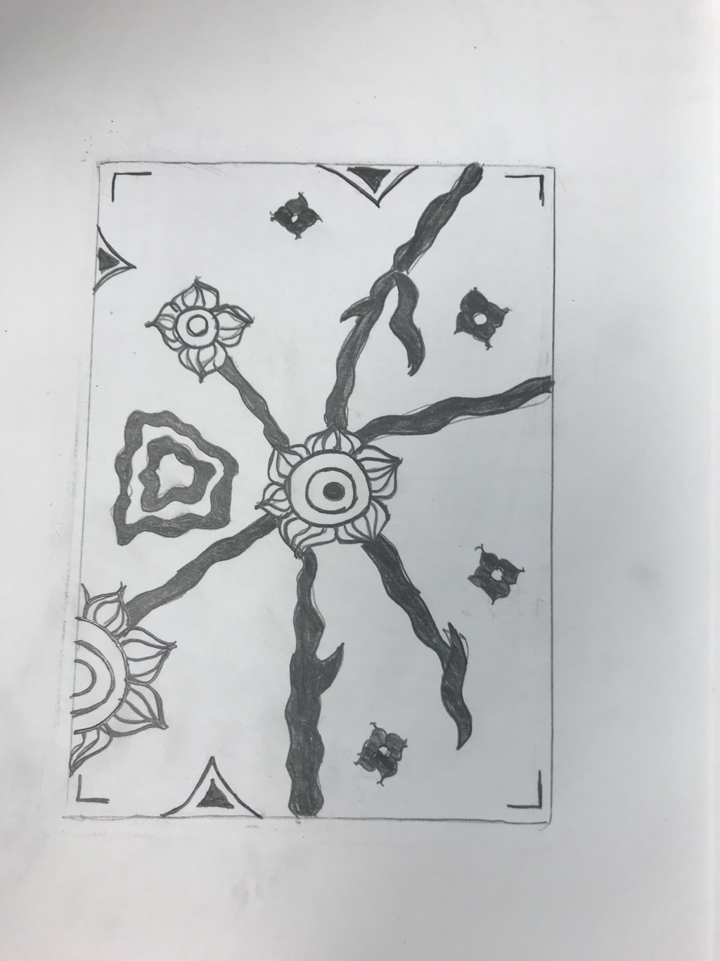 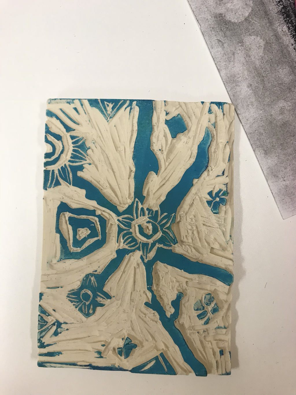 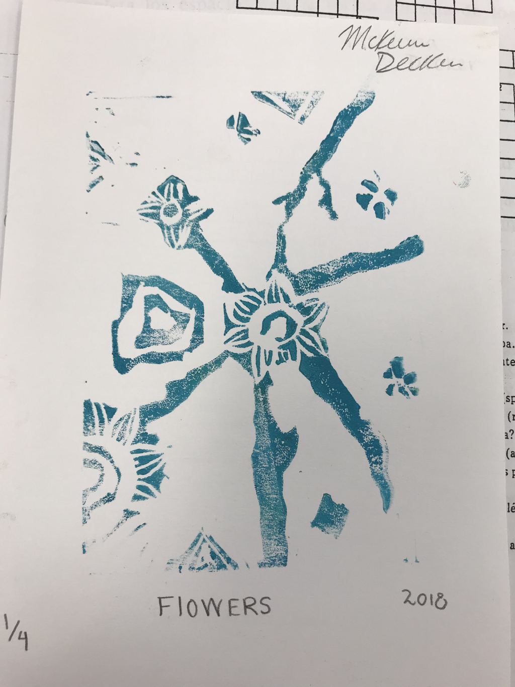 1. My piece shows off the theme of line because i used a lot of lines inside of the flowers and with the stems going of from everywhere.
2. My piece is successful because the flowers look cool but if i were able to do it again i would’ve taken more time to make it cleaner and put more details throughout all of it. 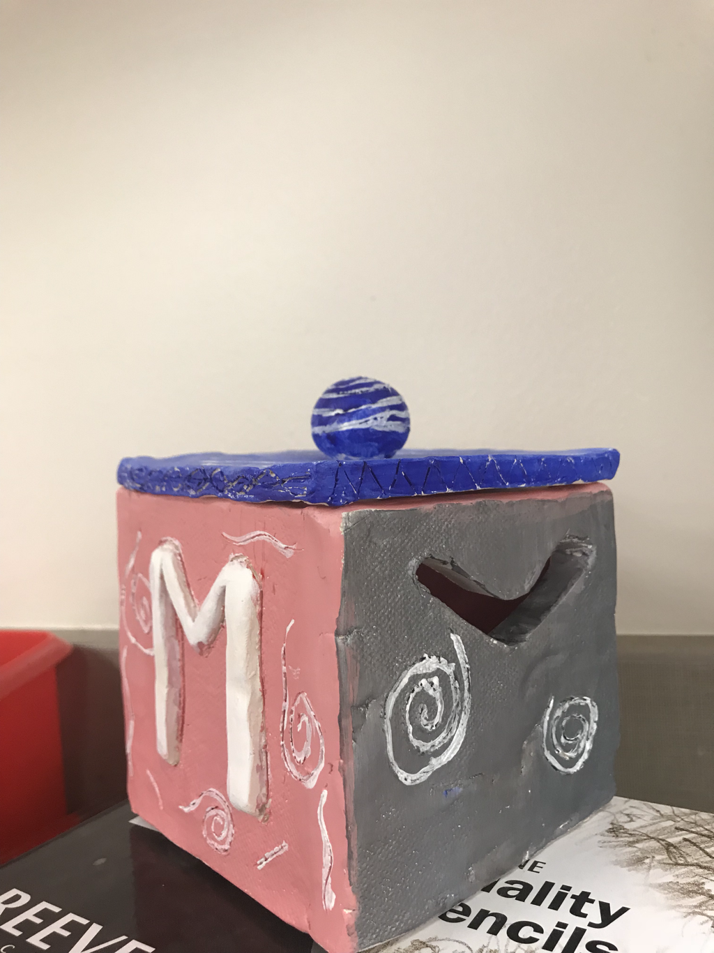 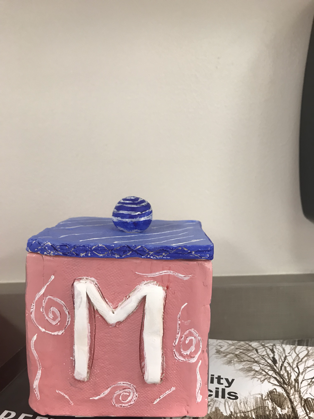 1. Since completing the in progress blog my piece has been put all together. It’s also been glazed, painted, and detailed.
2. I find successful how the colors look together and the detail on it looks cool. 3. If i were to do it again i would’ve made it with different and more clean detail and i wouldn’t painted it more cleanly. 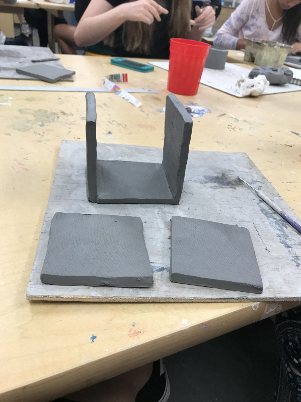 1. I plan to make a box where i can put things like jewelry in it. I plan to finish it by using paint with it and putting details on it.
2. Things i find difficult is trying to keep the clay not too wet but not too dry. To get it to stay up it couldn’t be really wet but when it was too dry you couldn’t use it. 3. I find successful getting the pieces cut at the right right height and length. 4. So far I’ve cut all of the pieces for my project. I’ve also scratched and slipped the edges to get the pieces to stay together. I was absent when we did the hue value scale. 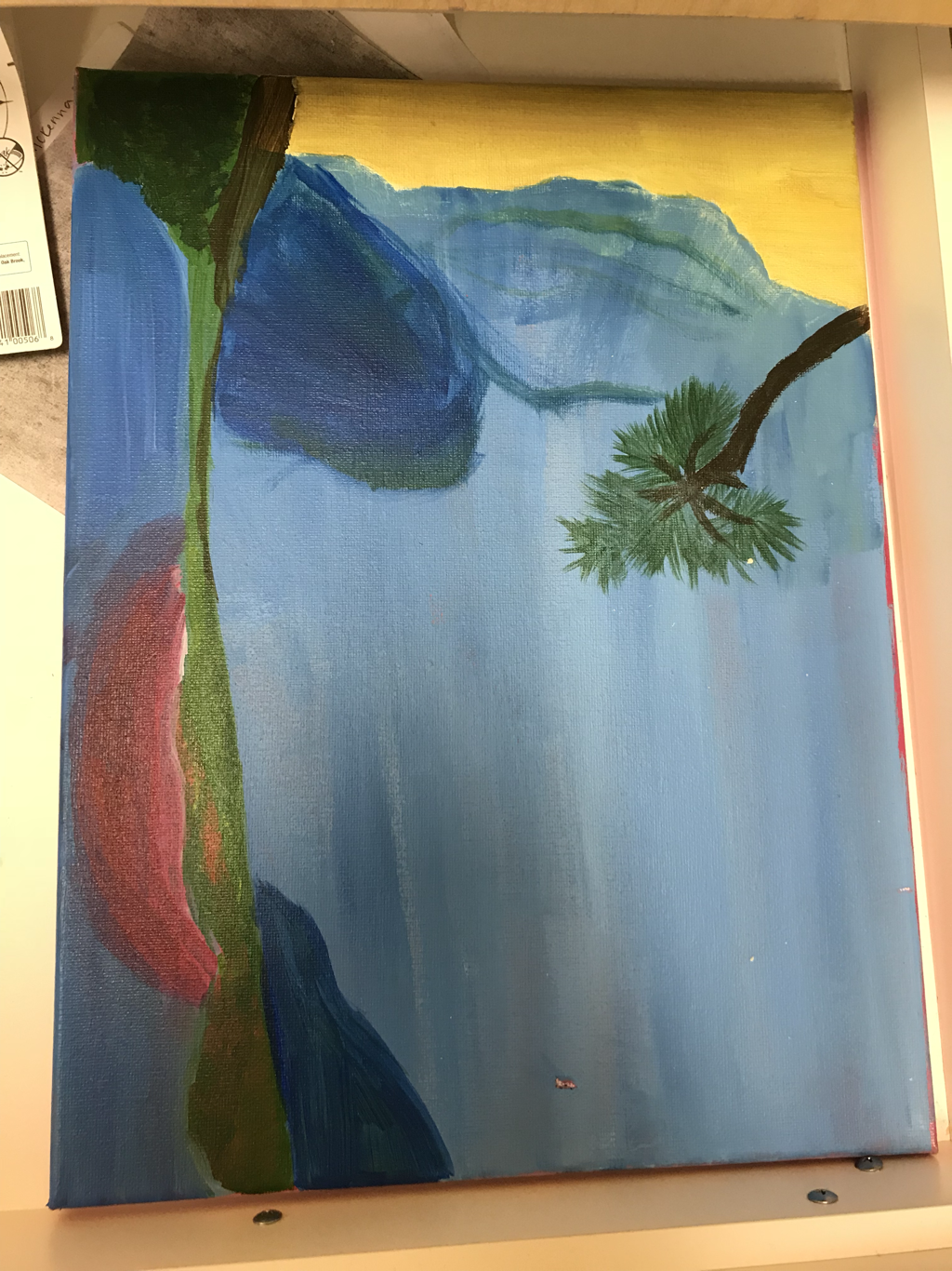 1. The place represented in my picture is the beach. It’s important because i grew up on the beach and i just love being there.
2 I found that trying to pick multiple different blues for the sky and the water was hard to do with paint to really show a difference so i had to make the sky darker than it looks in the picture. 3. I feel the most successful thing about my painting is the line where the water separates from the land in the ocean. 4. I started with the water because it takes up most of the space and then i drew the sand and the land that’s in the back. Then i drew the palm tree and sunset because they have the most detail and are based on the things around them. I was absent when we did the tested colors. You make brown by mixing anything opposite on the color wheel. 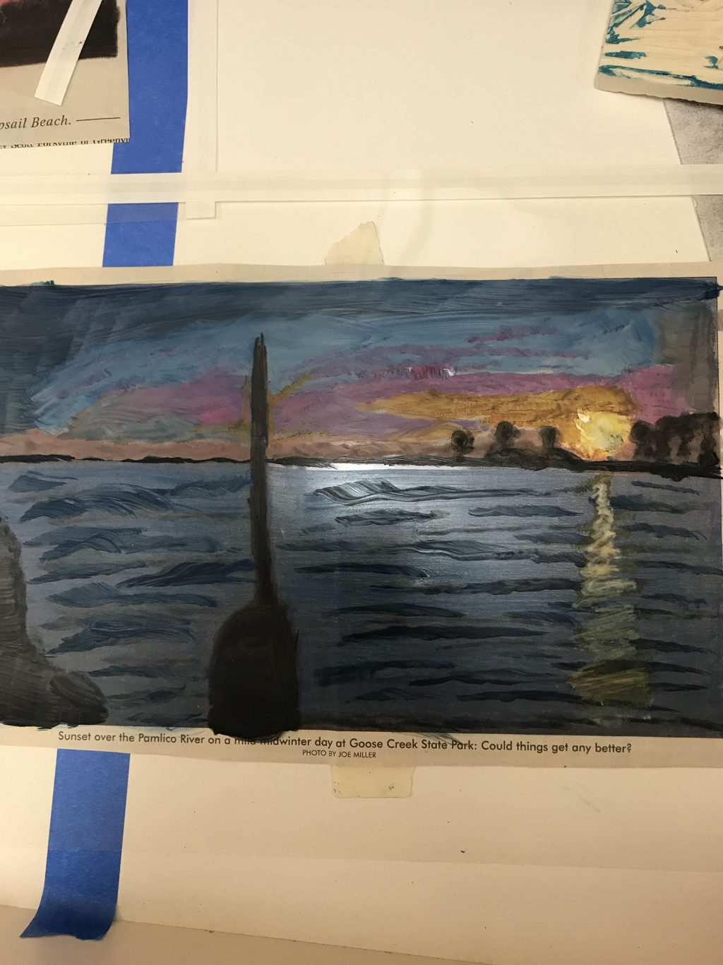 pencil drawing- pros: you can make it look very realistic cons: it can be difficult to make everything a different shade just by using a pencil 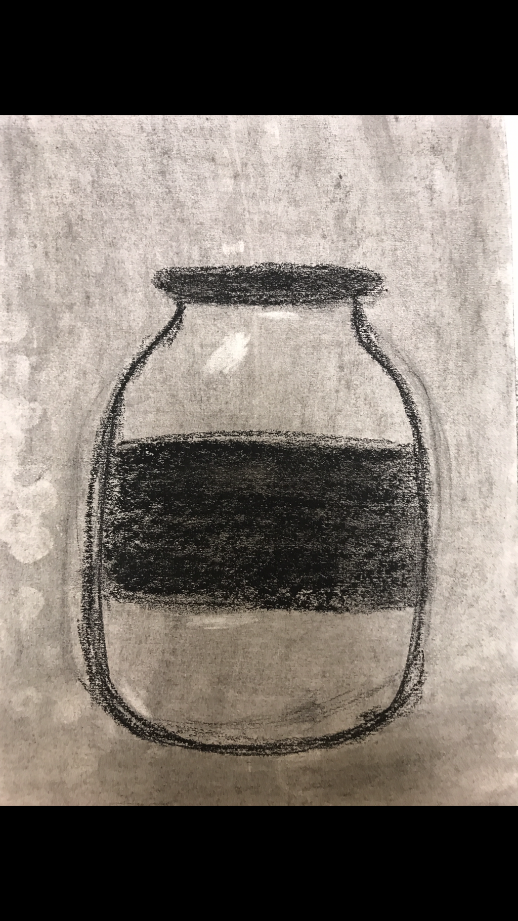 charcol- pros: if you make a mistake it is easy to fix cons: it was harder to make it seem more real 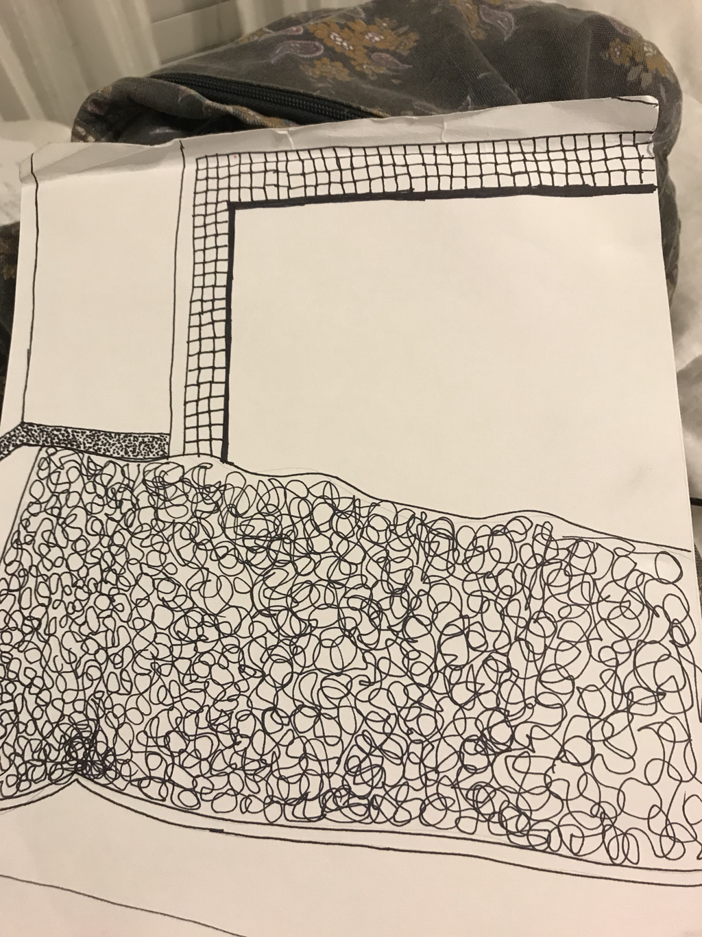 pen- pros: you can use a bunch of different patterns to make it look cool cons: if you make a mistake you can’t really fix it 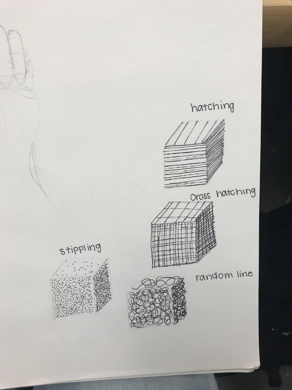 The pen cubes was the most helpful warmup to me because it shows what each thing can do and how you can make things look darker just by making it closer in that spot. Composition is the placement or arrangement of visual elements in a work of art. Value is the lightness or darkness of tones or colors.
|
 RSS Feed
